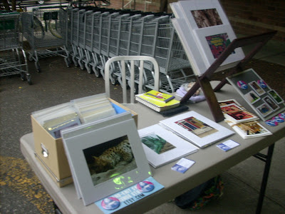
Since the sale season is starting soon, I thought I would offer up my table set up for critique and see how I can improve and upgrade my presentation. Now that I'm looking at these set-ups, they look pretty sad. Please leave comments and help! I'm wondering what's missing, accessories, boxes or stands for larger prints, frames, ways to use the vertical space...


I found these pictures of different set ups of the same seller that's helpful for ideas:
http://www.paperskirt.com/category/craft-show/

4 comments:
Hi! I think your setup is pretty nice overall! I think the ones where you have a long tablecloth look much nicer than the ones where you don't. It looks like you're going for a neutral color so as not to clash with your photos, but maybe something darker would make them stand out more? Like a dark green or blue maybe?
Believe me, I know how difficult it is trying to display lots of flat works on a 6ft table! I don't know if you remember from that one show we were both at, but I have a couple of tabletop magazine racks, which help take advantage of the vertical space. I got them here: http://www.displays2go.com/
They were really cheap, like $16 each.
Also, maybe find some clear acrylic boxes to put your photos in? That way the boxes take up less visual space and you can see the front photo through it.
Hope this helps!
Oh let's see if I can help. I like the second picture but it fells a little cluttered. But I like the overall colors - the woolen boxes and neutral table cloth. And the very last picture of Paper Skirts table. I love the height of it and the use of triangle/pyramid display.
Back when my job was doing displays in a dept. store that was the biggest deal displaying things in a triangle/pyramid shape. And I have to say, it really works. It draws the eye in and makes you look around. You can have a lot there and not feel cluttered.
So I definitely recommend getting some kind of small (break downable) shelf for the middle of your table with boxes or racks on either side and then it leaves a little room in front for small things. I use a wooden stair type thing that you can take apart. It adds a lot of height for me.
Hiya: I agree with Jen, a tablecloth is nice. Is there a way you can steam it or iron it? I realize it'll get lines when you fold it, but lines are better than wrinkles. Also, a larger table would be better, because people have to stand and look through your items, which obscures others from seeing your wares, but I think that's a comment with no solution because table sizes are tough for all of us.
I especially liked the set up in one of your last photos--the smaller items (cards?) lined up. Very nice and inviting looking.
Maybe you could try the same thing with your photos--do you have duplicates on the table? If so, consider removing them to a box under the table and just letting people see 1 of them?
Great start for sure, though!
your set up looks really nice! I know how hard it is to figure all of that out.
Post a Comment